Farrow & Ball
Pigeon
Meow! A shed painted Farrow & Ball Pigeon; photo via Farrow & Ball
Are pigeons… chic?
Yes, according to Carrie Bradshaw.
Last fall the Manhattanite sex columnist, played by Sarah Jessica Parker, was spotted cradling the hyper-realistic Pigeon clutch, hot off its debut on the JW Anderson runway. Parker was in New York, filming the second season of “And Just Like That.”
(Fowl fashion isn’t new to the “Sex and the City” universe — remember the crystal-encrusted Judith Leiber swan bag that Mr. Big gives Carrie in Season 2?)

The much-maligned rat o’ the skies, now in handbag form.
Well. Pigeons may be novel on the runway, but they’ve long been celebrated in the interiors orbit.
Just ask devotees of Farrow & Ball, the venerated British paint manufacturer: the word PIGEON conjures reveries of green-gray walls, cabinets, and millwork.
In this blog post, we’ll explore Farrow & Ball Pigeon’s undertones, discuss coordinating colors, review the best way to sample Pigeon, look at lots of photos of Pigeon used in real-life projects, and study the closest DUPES and MATCHES to Pigeon from more accessible paint brands, such as Benjamin Moore, Sherwin-Williams, and Behr.
Let’s get into it!
What Color is Farrow & Ball Pigeon?
Named after, well, pigeons, Farrow & Ball Pigeon is a medium SMOKY blue-gray-green, meant to evoke the bird’s signature plumage.
Pigeon is LIGHTER than Farrow & Ball Treron and Green Smoke.
Oh, and don't miss my dupes for Farrow & Ball Green Smoke
How Designers Use Farrow & Ball Pigeon
The paint color Pigeon is perhaps best known as a cult favorite for cabinets. Below, in this beautiful kitchen designed by Nune, the color is used to great effect. I love the Allied Maker pendants, too:

Cabinets are Farrow & Ball Pigeon. Photo by Nicole Franzen
Emma Burns, of iconic British interiors house Sybil Colefax & John Fowler, used Farrow & Ball Pigeon on the exterior doors and shutters of her 19th-century home in Oxfordshire. Doesn’t it look wonderful?


Doors and shutters are painted Pigeon. Photos by Paul Massey
And here’s an iPhone photo of the Pigeon-painted doors, taken by Burns:

Photo via Emma Burns
Below, designer Emma Sims-Hilditch (who creates beautiful, quintessentially English interiors) used Pigeon on the walls of this bedroom. The brilliantly designed custom bed is a perfect solution for the diminutive space, and I love the modern edge the Aerin sconce adds to the mix. The pillow fabrics are by Mimi Pickard, Teasel England, and Colefax and Fowler.

Walls are painted Pigeon; photo by Simon Brown
Pigeon works equally well in a bathroom. I love this beautiful space, below, by Polly Ashman — the millwork at left is Pigeon and the vanity is Studio Green. The sconces are from Pooky and the shade fabric is by Lewis & Wood. I like how Ashman softened the cool, moody palette with the Moorish vanity mirrors and scalloped jute rug — for similar ones, click here and here.

Photo by Sarah Griggs
Below, in Glennon Doyle and Abby Wambach’s Southern California primary bath, designer Kate Lester painted the wainscot Pigeon. The bathtub is by Lusso, and the fixtures are from Waterworks.

Wainscot is painted Pigeon; photo by Douglas Friedman
And let’s not forget about trim — Pigeon looks great there, too. In this 19th-century farmhouse kitchen, below, Monica Stewart painted the window casings and island Pigeon. The color works beautifully with the cerused oak cabinetry, brass hardware, and Namay Samay cushion fabric. The fixtures are by Evolve, Stewart’s own lighting line. I also appreciate that she didn’t Photoshop out the ceiling registers — most people do.

Photo by Kristin Karch
Stewart went whole hog on Pigeon in this project, drenching the adjacent living space and millwork in the color. The rattan pendant is from Serena & Lily, and the Lee Industries chairs are covered in a Cowtan & Tout fabric. Let’s take a look:


Photos by Kristin Karch
And you might not typically think of green for a dining room, but Pigeon works there, too, as seen in this Charleston home, below, designed by Basic Projects. The Cove chairs are by Nickey Kehoe, the slipcovers are in Rose Tarlow’s Rigoletto stripe in color Azzuro, the Slim Aarons photograph was found on 1stDibs, and the embroidered Inez tablecloth is by Porta.

Photo by Nicole Franzen
Farrow & Ball Pigeon Undertones
Farrow & Ball Pigeon has pronounced GREEN-BLUE undertones that can lean cooler (more green) or warmer (more gray), depending on the time of day, lighting conditions, and colors surrounding it. In natural light, particularly northern light, Pigeon’s undertones can appear cooler and more green, while in artificial light, it can appear warmer and more gray.
In this entrance hall, below, also designed by Sims-Hilditch, the wall paneling is painted Pigeon. Don’t you love the tartan upholstery on the wing chair? For a similar look, try Osborne & Little “Morlich” or Mulberry “Braemar”. The gorgeous hanging globe is by Jamb.
Notice, though, how Pigeon appears more traditionally blue-gray in this first photo:

Farrow & Ball Pigeon; photo by Jake Curtis
And here, in a photo of the same space, notice how Pigeon appears more blue-green:

Farrow & Ball Pigeon; photo by Jake Curtis
Complex paint colors can (and will!) shift depending on the amount of natural light your room receives, and the type of exposure (north, south, east, or west).
Farrow & Ball Pigeon Coordinating Colors
Farrow & Ball Pigeon looks lovely with cool grays, warm whites, pale beiges, light gray-greens, and dark blue-grays.
Save this image to Pinterest so you can easily remember these combinations and ideas:

PAINT COLORS: Schoolhouse White, Mizzle, Shaded White, Wimborne White, Cromarty, Studio Green, and Inchyra Blue
How to Use Farrow & Ball Pigeon in Your Home
Need even more ideas? Try one of these color combos with Pigeon:
Sarah’s Ready-to-Go Kitchen Scheme with Farrow & Ball Pigeon
I created this kitchen scheme to illustrate how you could use Pigeon on your kitchen cabinets and incorporate WARMTH and TEXTURE via other finishes. Save this image to Pinterest so you can easily remember these combinations:

LINKS TO ALL SOURCES: Sconce | Pendant | Subway Tile | Counter Stool | Faucet | Drawer Pull | Cabinet Knob | Countertop | Runner | Flooring
Using Pigeon with Other Paint Brands
If you’re using Farrow & Ball Pigeon with colors from a different paint brand, try one of these combinations:
- Pigeon with Sherwin-Williams Austere Gray, Accolade, and Cheviot
- Pigeon with Behr Sawgrass, Brooklyn, and Silver Ash
- Pigeon with Benjamin Moore Swiss Coffee, Dusty Miller, and Soot
Here’s an image you can save to Pinterest so you can easily remember these combinations:

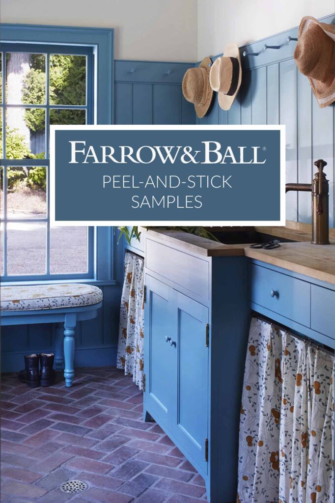
How to Sample Pigeon
My favorite way to test any paint color is with peel-and-stick samples. I’ve been using this resource for years, and they’ve been a game changer — their large samples are made with two coats of real paint. I also love that they deliver overnight. ‘Cause honey, sometimes your painter is coming and you need to make a DECISION.
Seriously, though, the ability to move samples from wall to wall is crucial, particularly with a complex color like Pigeon. Since its blue-green-gray tonality varies depending on lighting conditions, it’s essential to study the color on different walls and surfaces, at different times of the day.
Another reason I love peel-and-stick samples? They’re more cost-effective than ye olde traditional sample pots and are better for the environment, too. No mess; no wasted paint; no half-empty cans languishing in your basement. It’s a win-win.
Materials and Finishes to Use with Pigeon
With its balanced warm-cool undertones, Pigeon pairs well with a range of finishes. I suggest using Pigeon in combination with earthy, natural materials and textures, such as stone, wood, brass, and rattan. If you opt for cooler-toned finishes, look to materials that add depth, such as aged pewter hardware.
Below, Connecticut-based Moss Design paired Pigeon-painted cabinetry with an oak island and brass hardware, lighting, and plumbing fittings. Notice how the designers employ touches of black — the webbing on the counter stools, the shades on the light fixture, and even the Smeg toaster — to ground the palette:

Cabinets are painted Farrow & Ball Pigeon; photo by Jane Beiles
Don’t Be Afraid of Contrast
Contrast – the vital combination of light and dark tones, and warm and cool finishes – enlivens any design scheme and adds depth and personality to a space.
When using Farrow & Ball Pigeon in a room, try combining it with lighter and darker finishes, as well as materials that add warmth, to balance Pigeon’s cool undertones.
In the kitchen below, notice how Sarah Sherman Samuel invigorated the room’s palette by adding warm-toned finishes, furnishings, and textiles. These help balance the bright white walls and cool-toned cabinets and island, which are painted Pigeon:

Photo via Sarah Sherman Samuel
So if you’re using Pigeon on your kitchen cabinets, for example, you might select either a lighter countertop material, such as Carrara marble or quartz, or a darker one, such as this beautiful granite.
Then, you could add warmth to the palette by sourcing oak or walnut counter stools or a lovely terracotta floor tile.
Use your kitchen sconces or pendants to add depth to the scheme by choosing fixtures with a complementary finish, be it polished nickel, aged brass, zinc, or a blackened metal such as bronze or steel.
And Now, Let Us Discuss LRV
What’s LRV? If you’re acronym-averse, don’t panic.
LRV stands for light reflectance value. LRV is the AMOUNT of light a paint color reflects.
The LRV spectrum ranges from 0 to 100, with 100 being pure white (reflecting all light), and 0 being pure black (absorbing all light and heat).
If a paint color has an LRV above 50, it REFLECTS more light than it absorbs. If a color has an LRV below 50, it ABSORBS more light than it reflects.

The upper wall is painted Mizzle, the wainscot is Pigeon, and the built-ins are Shaded White, via 1894Home
Bear in mind, though, that no paint color has an LRV of 100 or 0.
The highest LRV you’ll find in consumer paint is around 92 (see: Chantilly Lace, High Reflective White, and All White); the lowest averages out around 4 (see: Tricorn Black, Black, and Pitch Black).
For any super nerds out there (my hand is raised), scientists at Purdue recently developed a white paint that reflects 98 percent of light; you can read about that here.
But heed this, friends: high LRV does not necessarily equal WHITER paint.
Warm, creamy paint colors can have very high light reflectance values. (See: Cheviot; Wimborne White.)
Farrow & Ball Pigeon LRV
The LRV of Farrow & Ball Pigeon is 34.
That means Pigeon is a mid-tone color, but is decidedly on the darker end of the spectrum. Here’s a comparison graphic I created, showing Pigeon with other green-gray Farrow & Ball paint colors:

In a space with ample natural light, Farrow & Ball Pigeon can pass as a pale greenish-gray. But it can easily turn MOODY, particularly in a room with minimal natural light.
In the bedroom below, designer Kate Lester used Pigeon on the wainscot. The color appears significantly darker than in some of the other images we’ve seen above.
And notice how Lester combined Pigeon with warmer finishes (such as the pink Oonsai wallcovering):

Wainscot is painted Farrow & Ball Pigeon. Photo by Douglas Friedman

Walls are Farrow & Ball Pigeon. Photo by Joshua McHugh
Above, notice how the McGraths balanced the coolness of Pigeon with warm finishes, including the rust-colored Rogers & Goffigon “Debitage” sofa fabric and the yellow table lamp by Thomas O’Brien. The “Kelly Stripe” ottoman fabric is by Fleurons d’Helene, and the rattan sofa and chairs in the background are by Palecek.
If you test a sample of Pigeon and it feels too DARK, try sampling Farrow & Ball Blue Gray.
If you find Pigeon too LIGHT, take a look at Farrow & Ball Treron.
Farrow & Ball Pigeon Matches and Dupes
Before we dive into DUPES, bear in mind that rarely do we unearth exact matches for Farrow & Ball colors from more accessible brands, such as Sherwin-Williams and Benjamin Moore.
True, Sherwin-Williams makes a near-perfect match to Farrow & Ball French Gray, but several popular Farrow & Ball colors are notoriously tricky to match.
So if you love Pigeon, and can stomach the $130-per-gallon price tag, I encourage you to purchase the real thing. Benjamin Moore, Sherwin-Williams, and Behr offer colors similar to Pigeon, but they aren’t perfect equivalents.
But if you’d rather not break the bank, then read on, fellow paint obsessive, for the closest dupes and matches to Farrow & Ball Pigeon. And save this image to Pinterest so you remember this post when you’re heading to the paint store!

Farrow & Ball Pigeon Matched to Benjamin Moore
The closest Benjamin Moore match to Farrow & Ball Pigeon is Oil Cloth CSP-760.

Part of Benjamin Moore’s Aura Color Stories collection, the evocatively named Oil Cloth isn’t recommended for exterior use.
So if you want to paint your shed (for your kitty?), you’ll need to use a different color.

Look how happy this fluffster is with his Pigeon shed. Photo via F&B
And while Oil Cloth is close to Pigeon, it’s a hair lighter and cooler. More blue-green; less muddy gray.

Oil Cloth; design by Oakstone Homes; photo by Lauren Konrad

Cabinets are Oil Cloth; design by Heidi Caillier

Wainscot is Oil Cloth; design by Two Twenty One
Benjamin Moore Heather Gray 2139-40 has the same LRV as Pigeon (34) but is noticeably more saturated. It appears quite blue-green in comparison.

It’s very pretty on trim, doors, and mantels, as seen here:

Benjamin Moore Heather Gray; design by Jourdan Fairchild
More photos of Heather Gray:

Benjamin Moore Heather Gray; design by M House Development

Benjamin Moore Heather Gray; design by JSE Interior Design
And Benjamin Moore Sabre Gray 1482 is somewhat similar to Pigeon, but is considerably lighter and cooler.
Farrow & Ball Pigeon Matched to Sherwin-Williams
Does Sherwin-Williams have a match to Pigeon? Is it as close as Benjamin Moore? Do I ask rhetorical questions?
The fact is, while Sherwin-Williams sells some very close matches for Farrow & Ball colors (bonjour, French Gray, Mizzle, and Cromarty), Benjamin Moore’s sheer NUMBER of offerings gives it a competitive edge over Sherwin-Williams in the matching department.
Benjamin Moore touts more than 3,500 colors, while Sherwin-Williams offers fewer than half that many. The latter company has 1,232 paint colors in its active portfolio, and 220 archived colors.
That being said, if you’re a ride-or-die Sherwin-Williams fan, take a look at Downing Stone 2821. A mid-tone gray with a green undertone, Downing Stone bears more than a passing resemblance to Pigeon. It’s lighter and reads more gray, but the two colors are similar.

Also check out Sherwin-Williams Rushing River 7746.
Rushing River has a more pronounced beige-brown undertone than Pigeon, but it looks lovely on doors, as seen in this space by Yond Interiors:

Rushing River; photo by Amanda Birnie
Rushing River is also a beautiful choice for a home exterior:

House body is Rushing River; design by Thistlewood Farms
And Rushing River is verrry pretty on garage doors, too (and you can find these exact doors here):


Design by Laura Hodges
Farrow & Ball Pigeon Matched to Behr
The closest Behr match to Pigeon is a color wincingly called Confederate N370-4. (Behr, time to update that name.)
Confederate is quite close to Pigeon; not as close as Oil Cloth, but a bit closer than Downing Stone and Rushing River.

Also look at Behr Battleship Gray (darker than Pigeon) and Behr Strong Winds (lighter than Pigeon).
Color Matching at the Paint Store
If none of these matches is your cup of tea, order a sample of Pigeon and bring it to the paint store.
It’s likely that your paint retailer, be it Sherwin-Williams, Benjamin Moore, Behr, or PPG, already has Pigeon’s color code saved in its computer. But always bring a sample, just in case.
Purchase a quart of your color match, and paint a swatch at home. Then compare it to the peel-and-stick sample of Pigeon.
Some paint companies match Farrow & Ball colors better than others, so I always recommend testing a quart sample before buying gallons of your match and being unpleasantly surprised.
In Conclusion, Dear Reader
(a) Farrow & Ball Pigeon is a beautiful blue-green-gray paint color
(b) Pigeon is highly versatile; consider using it on cabinetry, walls, trim, wainscoting, doors, or shutters
(c) it’s very important to sample colors before you commit
(c) while Pigeon has close matches from other paint brands, such as Benjamin Moore, Sherwin-Williams, and Behr, no one makes an exact dupe.
If you’ve decided to skip the dupes and splurge on real Farrow & Ball paint, take comfort in knowing that a gallon of Pigeon is nowhere near as pricey as the JW Anderson pigeon clutch. That will set you back $890.